Archive - Creator Management UX Case Study.
Designing, building a minimum-viable-feature front-end in just three days instead of weeks? That's the story. This project took a full-cycle approach—from UX discovery, design iterations, and development planning to coding and deploying a working prototype with limited functionality and mock datasets. Despite the intense timeline, the result was an interactive, high-fidelity coded prototype with sophisticated UI aimed to transform influencer marketing workflows.
Try it the app here: https://creators-five.vercel.app/
The client: Established Influencers Platform
Archive.com is a leading creator management platform that enables brands to streamline influencer marketing. The company has raised over $8 million in funding and helps brands manage thousands of influencers across Instagram, TikTok, and YouTube. This project was commissioned by Archive to solve a critical inefficiency: customers were spending excessive time manually managing influencer relationships using spreadsheets.
Client Brief
Archive needed a robust solution to enhance influencer marketing workflows. The core requirements included:
Reviewing UGC (User-Generated Content) and social profile statistics across TikTok, Instagram, and YouTube.
Creator data management with custom attributes and segmentation capabilities.
A messaging system for direct brand-to-creator communication.
A visually intuitive interface to replace outdated spreadsheet-based workflows.
Original Client Brief:

Design Process
Starting with a deep analysis of influencer marketers’ workflows, I conducted UX discovery to have deep understanding of the core problem and ways to solve it later in design.
Here's the initial UX research session board:

🔎UX Discovery Board
After that I created wireframes and high-fidelity mockups in Figma. The key pain points identified included inefficient creator discovery, difficulty in tracking social performance, and fragmented communication channels.
To address these, I used design system using Ant Design components, customizing them for a distinct yet consistent visual experience.
The most challenging UX elements were the profile drawer system and messaging interface, requiring multiple iterations to balance information density with usability.
Given I was designer and engineer on this project, I was constantly cross-stream working in figma and dev environment, often making quick, sharp meaningful updates to accommodate better UX or make engineering more efficient.
You can see the figma of designs here:
🎨Figma Designs File
Development Approach
With just three days for implementation, I made strategic decisions to maximize efficiency.
Phase 1:
Established component architecture and implemented the design system.
Built core application structure using Next.js 15 and React 19.
Developed navigation, creator cards, and search functionality.
Configured TypeScript interfaces for strict type safety.
Deploy: Vercel + GitHub automated process.
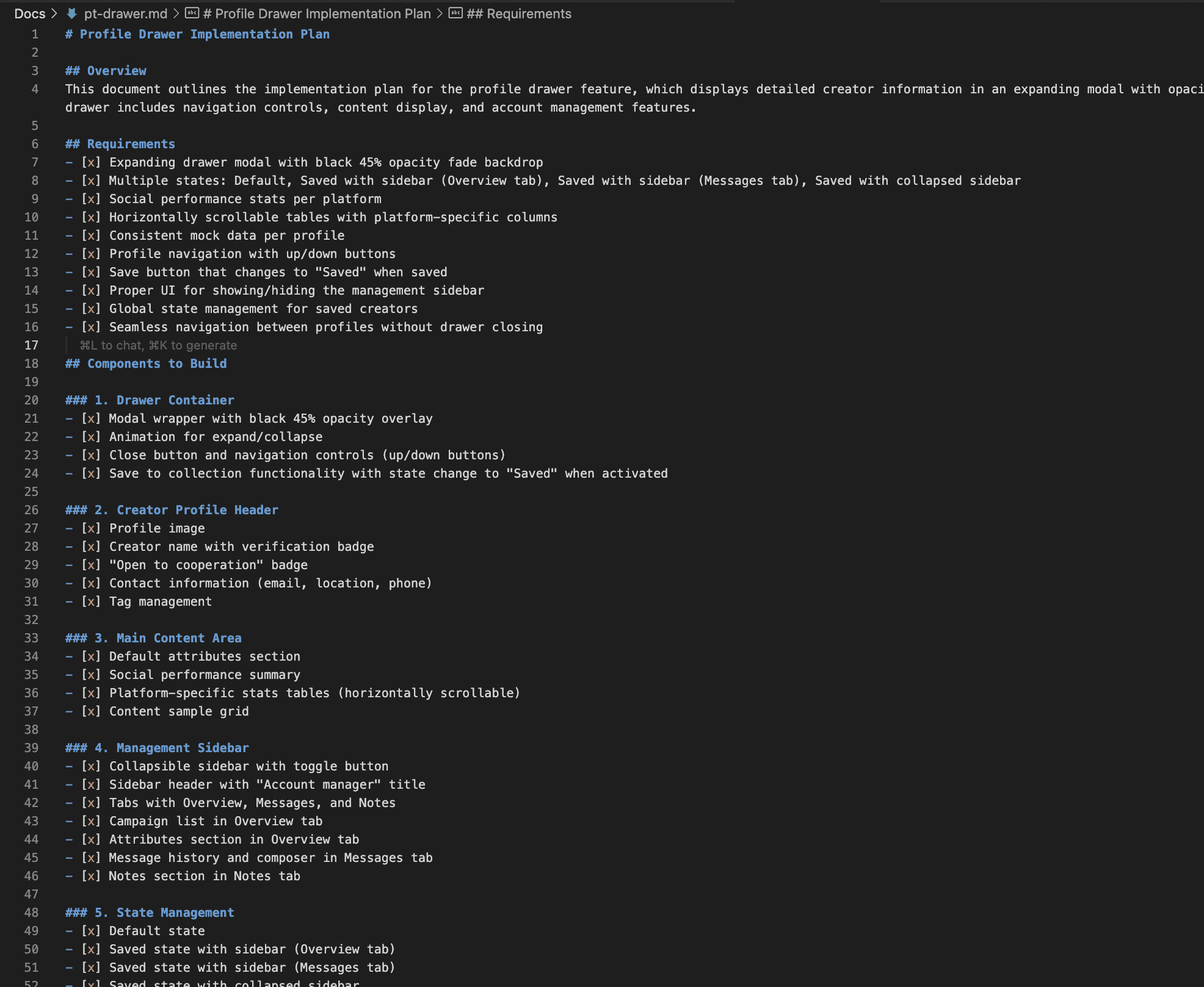
Created comprehensive, detailed implementation plan and context documents to follow with copilot
Code structure:

Here's the original Development Plan to have development streamlined, structured and keep track of process:
GitHub of the application:
https://github.com/Nazary21/creators
Phase 2:
Developed the creator profile interface and messaging interface.
Designed a responsive profile drawer for seamless transitions between views.
Implemented social performance analytics components to visualise key engagement metrics.
Creator Profile Drawer
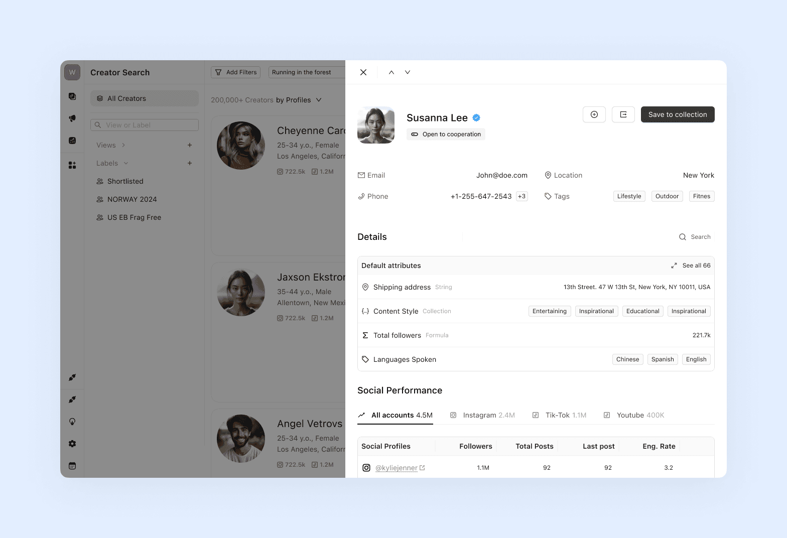
Creator Profile Drawer, Added to user Creator Management suite, with messaging UX:

Phase 3
Focused on UI polish, performance optimization, and bug fixes.
Implemented custom mock data-sets generator, that also gets unique images for creators' content.
Improved animations, refined responsive behaviors, and standardized styling.
Resolved specific challenges like padding issues in the messaging interface and optimized creator stat displays.
Final phase was deploy on Vercel and final UI refinements of deployed app.
Technical Implementation
The platform was built with Next.js and React, emphasizing component reusability and scalability. The styling architecture ensured clean specificity patterns while allowing for modular customization.
Since this was a prototype phase, I designed a structured mock data system that mimicked real API responses, allowing for a seamless transition to live data in later development stages.
Key Features Implemented
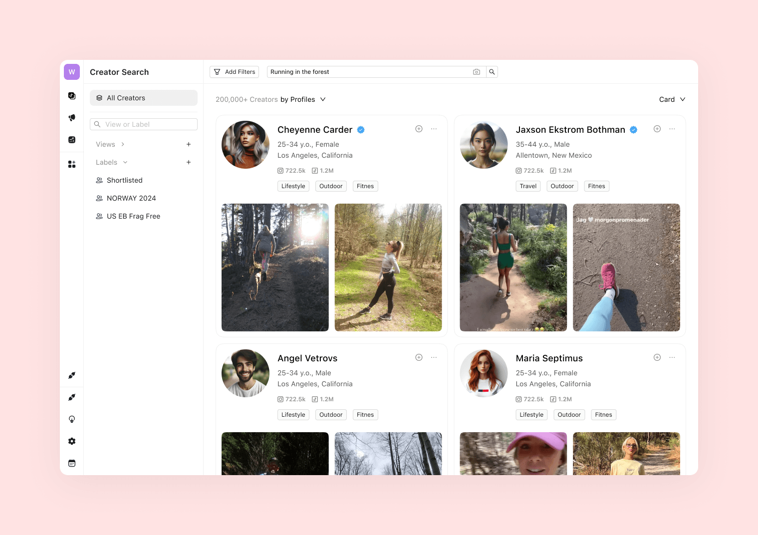
Creator Discovery Interface: A search and filtering system interface that allows brands to browse influencers with detailed profile insights.
Consolidated Creator Profiles: Scalable, reusable UX surface to find, add and manage Creators. Unified data aggregation across Instagram, TikTok, and YouTube, with customizable attributes.
Creator Management Sideba: Built-in interface of creator management with overview and communication tool with conversation history based on mock datasets and templates.
Results and Learnings
The prototype successfully demonstrated the potential of a dedicated creator management platform. Despite the tight three-day timeframe, I delivered a functional, high-quality MVP that:
Increased coverage of influencer management by an estimated 40%+ of the overall management user journey compared to manual methods. Messaging, follow-ups and constant interaction are huge and the most challenging parts of process that can now be handled in unified place.
Provided solution for brands with instant access to social performance data, improving decision-making speed.
Laid the groundwork for Archive’s next-stage fully functional feature development, contributing to its continued growth as a leading influencer marketing solution.
Key learnings from this project:
Absolutely lightning idea to live implementation speed having polished front-end in place, eliminating weeks of design-eng-qa cycles in traditional engineering setup, just to test a hypothesis.
Effective architecture strategies for scalable component-based systems.
Techniques for simulating backend functionality during prototyping.
UI performance optimization for handling complex, data-rich interfaces.
There's no magic pill even with copilot development. 90% of the UI was thoroughly refined having constant adjustments in styling, managing updates and fixing issues. Copilot systems succeed have roughly less than 10% success rate to actually produce anything meaningful based on prompts.
This whole project took me 3 days.
This project exemplifies my approach to product design and development: understanding business challenges, crafting user-centric solutions, and implementing functional testable version to validate solution that drives real-world impact at scale.
Extra: Design System with 90% design tokens code coverage
First iteration was visually refined yet… It lacked proper color token system as while refining a lot of tactical decisions were made for visual appealing feel sacrificing proper design system setup. So next phase would be to transition into design tokens world where no elements remain hard-coded.
So as next phase I implemented structured design system with a tokenised approach. This system streamlined development, enabling rapid iterations while maintaining a cohesive user experience.
Design Token Strategy
Replacing hardcoded values with semantic design tokens created a single source of truth for visual attributes. This approach improved maintainability and allowed for seamless updates across the prototype. The token architecture includes:
Color System: A structured palette with brand colors, an extensive gray scale, and functional tokens for surfaces, text, and status indicators.
Typography Scale: A flexible font system with predefined sizing and weights for UI consistency.
Spacing System: A modular 4px grid ensuring uniformity across layouts.
Component-Specific Tokens: Dedicated tokens for recurring UI patterns like cards, messages, and form elements.
Token Implementation Coverage
Systematic refactoring led to high adoption of design tokens across the prototype:
Card Components: 95% token coverage, standardizing surfaces, borders, and shadows.
Button Styles: 90% consistency across primary, secondary, and tertiary buttons.
Text Colors: 95% tokenized for uniform application across UI elements.
Background Colors: 85% adoption of surface tokens for a structured hierarchy.
Borders and Shadows: 85% implementation of a standardized system.
Interactive Elements: 90% tokenized hover states and focus indicators.
Profile Drawer: 95% token implementation for a complex, high-usage component.
Social Components: 90% token coverage across tables, tabs, and stats displays.
Component Architecture Principles
Beyond tokens, I established a modular and scalable component architecture:
Consistent Naming Conventions: Using
[component]-[element]-[modifier]for clarity and maintainability.Minimal CSS Specificity: Ensuring flat selector structures to prevent cascading conflicts.
Responsive Design: Components adapted fluidly across different screen sizes.
Accessibility-First Approach: Proper contrast ratios, focus states, and semantic HTML for improved usability.
This structured approach resulted in a scalable, visually cohesive UI that ensures long-term maintainability and seamless future iterations.


